
Color Theory for Decorating
Do you know how color combinations are formed? Have you ever used a color wheel? This article explains the details on color theory and how to use a color wheel.
Originally published in 2020 but updated in 2026.
Disclosure: This post may contain affiliate links. Please read my disclosure policy.
For someone who loves neutrals, it may seem odd for me to write a post series on color theory, right? Well as any interior designer knows, color theory is very important to know when designing a space.
Did you know that we see colors first before any other elements in a space? We see color then shapes, then all other elements.
Learning about color theory and how to use a color wheel takes the guesswork out of picking colors in decorating. But what is color theory anyway?
What is color theory?
There is a reason that certain color groupings look good together and that’s why it’s good to understand how color groupings work because then you will have a foolproof way of decorating your home with color.
Using a color wheel is the best way to learn about the different color groupings and about color itself.
The Basics in Color Theory
Let’s go through all the colors represented on the color wheel and how they pair together.
Primary and Secondary Colors
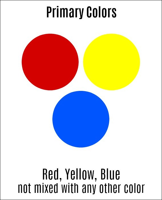
The primary colors are red, blue, yellow not mixed with any other color.
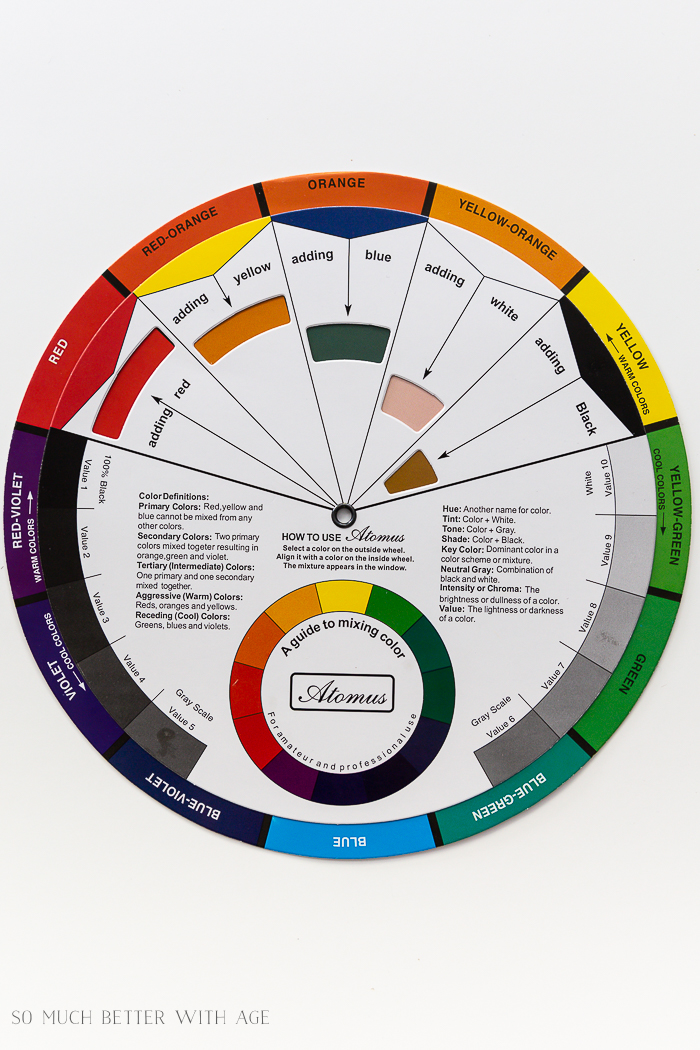
Secondary colors are two colors mixed together. Red + Yellow = Orange | Yellow + Blue = Green | Blue + Red = Violet

Tertiary Colors
Tertiary colors are made when you mix equal parts of one primary color and one secondary color together to get these colors: Red-Orange | Yellow-Orange | Blue-Green | Violet-Blue | Red-Violet
Tint, Shade and Tone
Then if you take a pure color and add white, black or grey to it, they become a tint, shade or tone of a pure color.
- TINT: adding white to a pure color
- SHADE: adding black to a pure color
- TONE: adding grey to a pure color
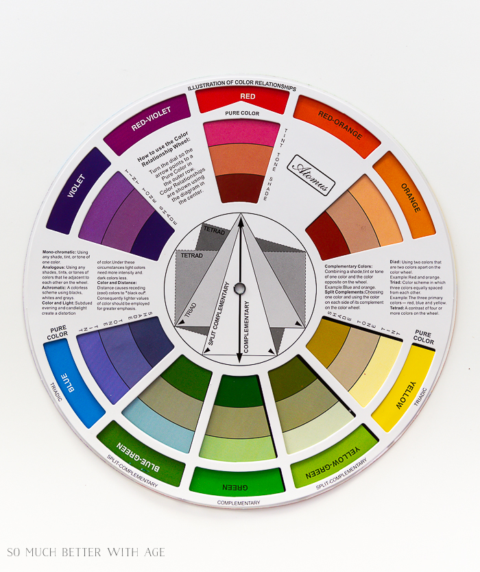
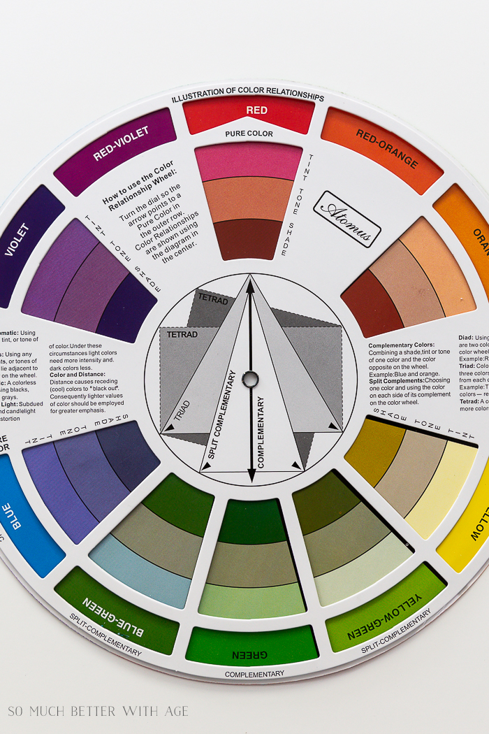
Look under RED in the color wheel below and you’ll see the colors of tint, tone, and shade under it.
Warm and Cool Colors
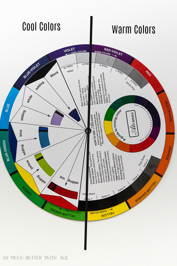
Warm colors are reds, yellows, oranges. Cool colors are blues, greens, violets.
Also To Note
- Chroma – the degree of vividness or intentsity
- Color Temperature – warm or cool colors
- Undertone – except for primary colors (red, blue and yellow) all colors are made by mixing two or more colors together.
color harmony groups
These are the harmony groups to decorate by which we will be going through with many room examples in this 4-part series.
- Achromatic – colorless scheme (no hue) using black, white and grey only
- Accented Achromatic – an accent color added to an achromatic color scheme
- Analogous – using 2-4 colors that are adjacent to each other on the color wheel
- Accented Analogous – using analogous color scheme and adding the complimentary color to the central color
- Clash – one color and another that is directly to the left or right of its compliment
- Complementary – using 2 colors that sit directly opposite each other
- Split Complementary – using any color along with the color either side of its complement
- Monochromatic – using a tint, tone or shade of just one color
- Tetrad -using a combination of 4 colours that are equally spaced on the color wheel
- Triadic– using any 3 colors that are equally spaced from each other on the color wheel
Moving the Color Wheel
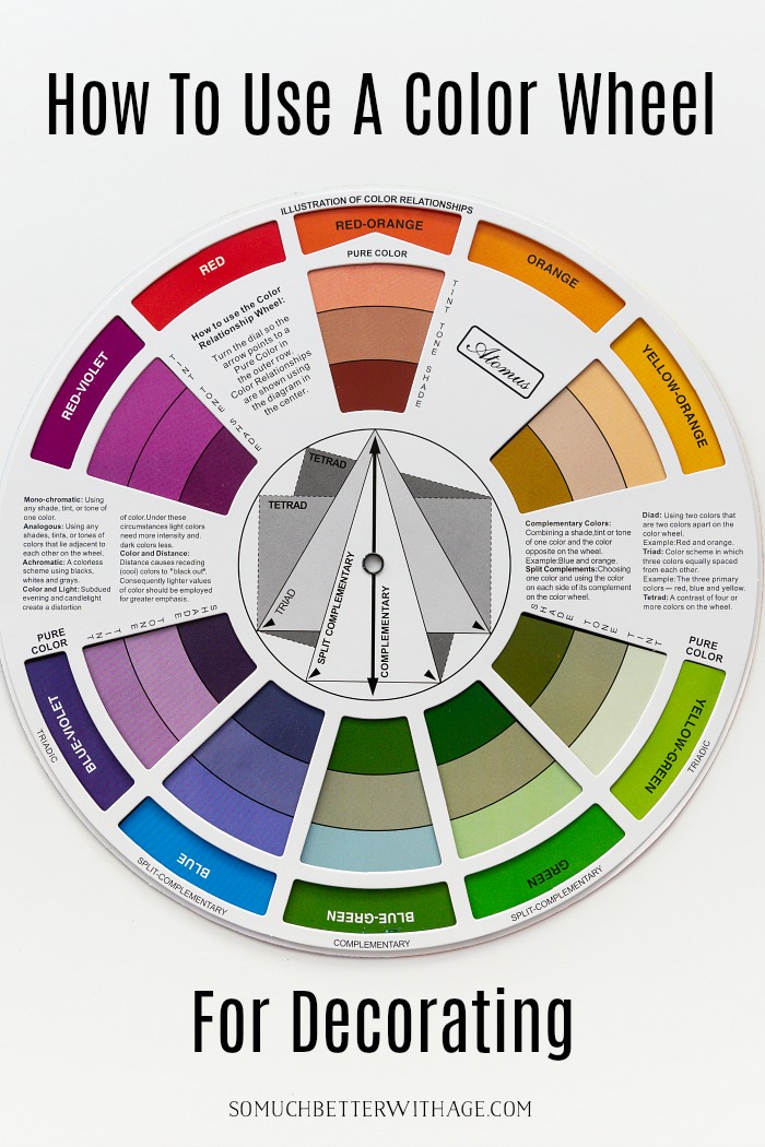
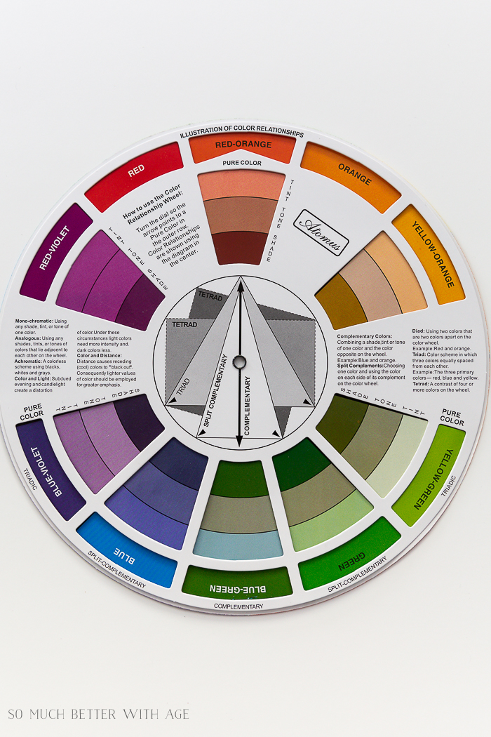
Looking at the color wheel below, in the middle you can see different arrows and boxes. You can see how the red-orange colors blend with the blue-green colors to have a COMPLEMENTARY color grouping.
You can also see how the points on the boxes produce TETRAD harmony groups, TRIAD and SPLIT COMPLEMENTARY groupings too. Using a color wheel is a foolproof way of seeing which colors (along with the correct tint, tone and shade) go well with each other.
But don’t get overwhelmed, because we are are just starting and you’ll get it by the end of this series.
To continue on this 4-part series, head over to Lesson 2: Decorating with Complementary Colors. You’ll get to know what each color harmony group is in more detail along with many room examples!

click in case you missed:
Lesson 2 Decorating with Complementary Colors
Lesson 3 Decorating with Achromatic, Analogous and Monochromatic Colors
Lesson 4 Decorating with Split Complementary, Tetrad, Triadic and Clash Colors


Congrats Jamie and this was a extremely informative post on color!…thank you.
Have a beautiful week!
Thanks so much, Shirley!
Hugs, Jamie
CONGRATULATIONS, JAMIE!!! I am so so proud of you and a little jealous, in the best of ways!!! You have done what so many of us would love to do!!!!
Thank you so much for explaining color! It is quite a difficult theory and you made it so understandable!
xo
Aww, thanks Yvonne! It’s very exciting!
Big hugs, Jamie