
Complementary Colors
Do you want a foolproof way to decorate with color? Follow this color theory series to learn more. Today it’s all about complementary color scheme!
Disclosure: This post may contain affiliate links. Please read my disclosure policy.
Continuing on in our color theory series, I’m going to share with you a complementary color scheme in interior design. Read more in the post, the basics of color theory.
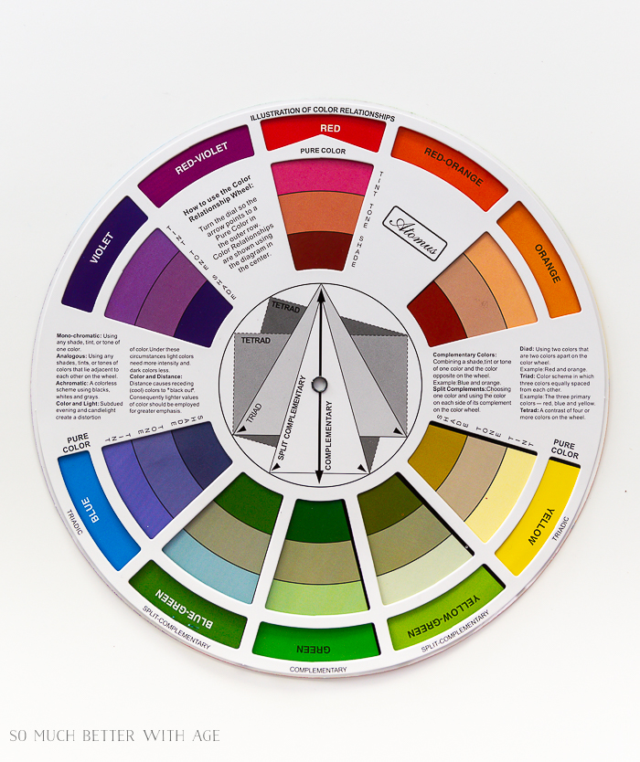
Before we begin, here are the main color harmony groups:
Color Harmony Groups
Achromatic – colorless scheme (no hue) using black, white and grey only
Accented Achromatic – an accent color added to an achromatic color scheme
Analogous – using 2-4 colors that are adjacent to each other on the color wheel (yellow-orange / yellow / yellow-green)
Accented Analogous – using analogous color scheme and adding the complimentary color to the central color (yellow / yellow-green / green / violet)
Clash – one color and another that is directly to the left or right of its compliment (green / red-violet)
Complementary – using 2 colors that sit directly opposite each other (red / green)
Split Complementary – using any color along with the color either side of its complement (blue / yellow-orange / red – orange)
Double Split Complementary – using a combination of 4 color that contain 2 sets of complements (blue / green / red / orange)
Monochromatic – using a tint, tone or shade of just one color (1 color)
Tetrad -using a combination of 4 colours that are equally spaced on the color wheel (green / blue / yellow / red)
Triadic– using any 3 colors that are equally spaced from each other on the color wheel (green / violet / orange)
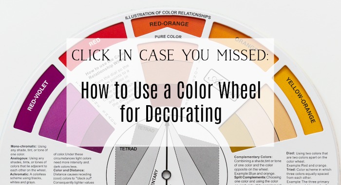
Click to buy your own inexpensive artist’s color wheel here.
What is a complementary color?
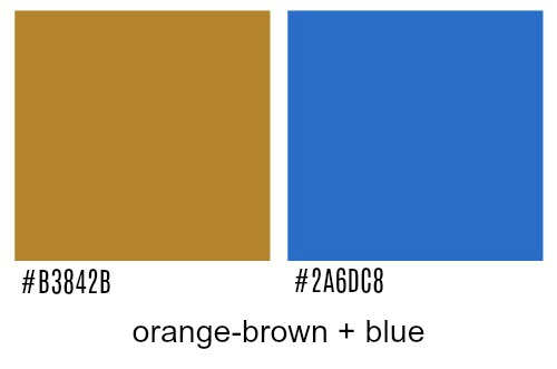
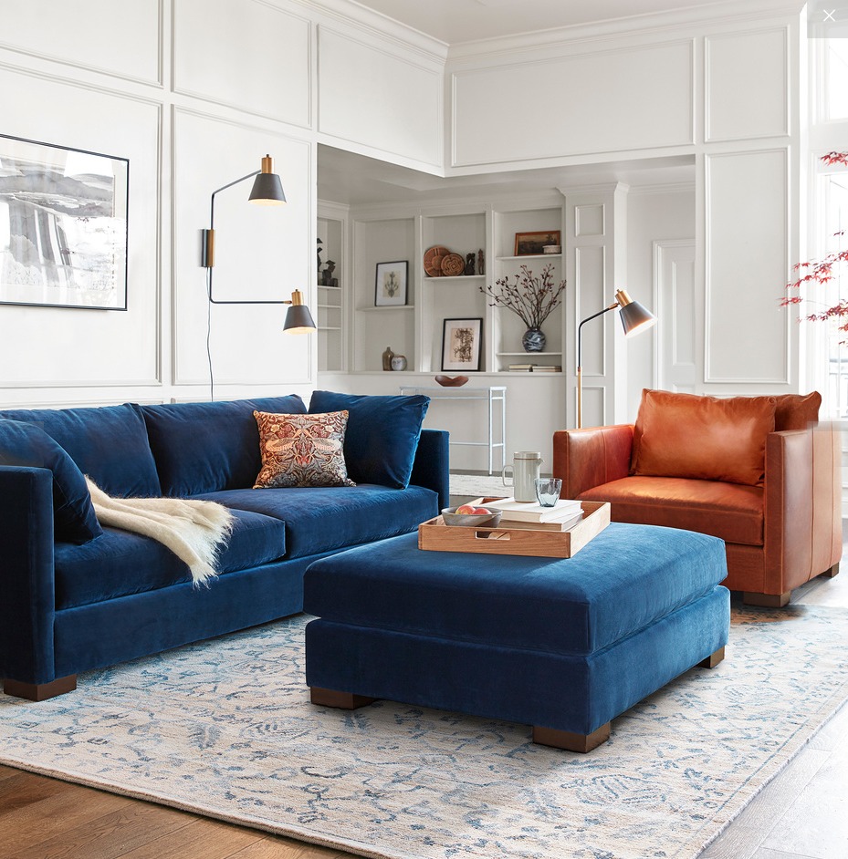
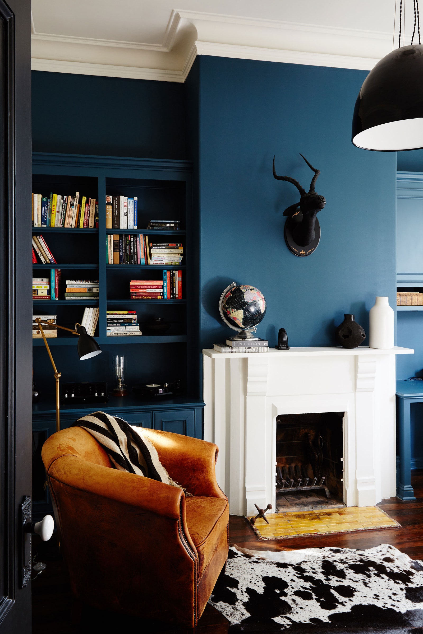
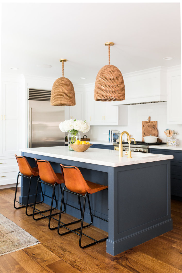
Complementary colors are the complete opposite colors on the color wheel and it’s no wonder when we see navy walls with browny/orange leather couch or chairs that it looks soooo good!
Complementary Color Scheme Examples
orange-y brown and blue
When you look at blue on the color wheel, you’ll see the complementary color is orange. Full chroma blue and orange colors do look good together but it may not be what you want to decorate with but the value of the color in lighter tints, tones and shades will give you lots of options to decorate with. Just look at the beautiful blue and orange complementary color schemes below.


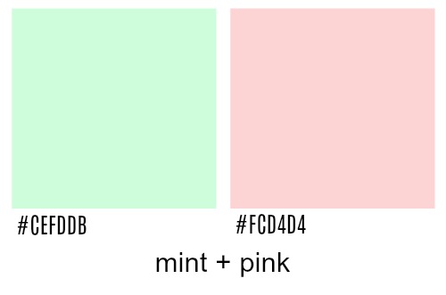
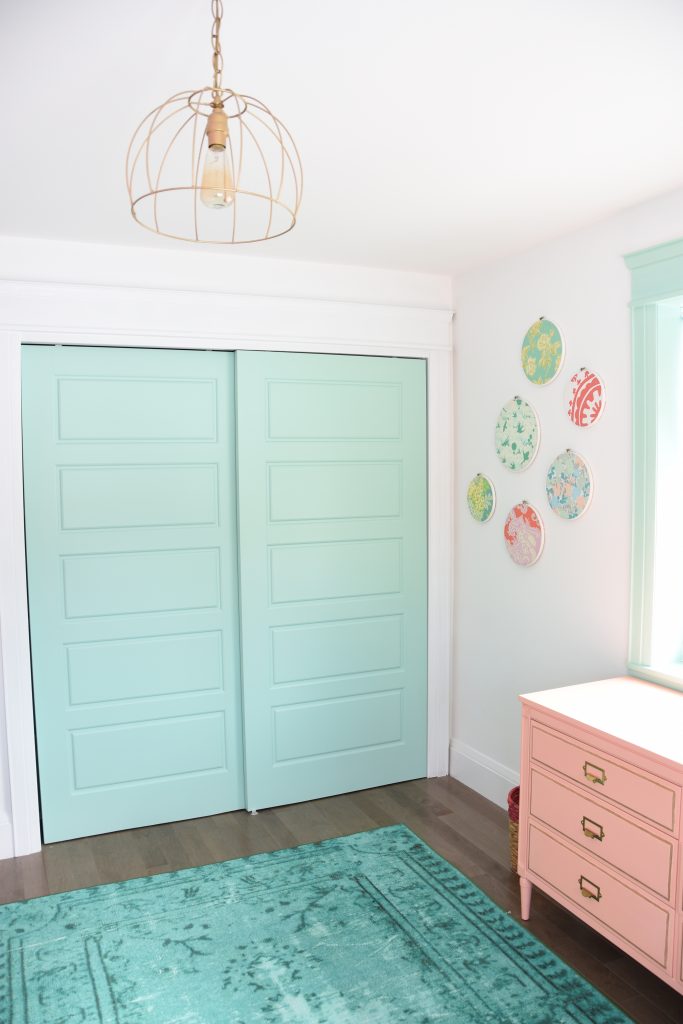
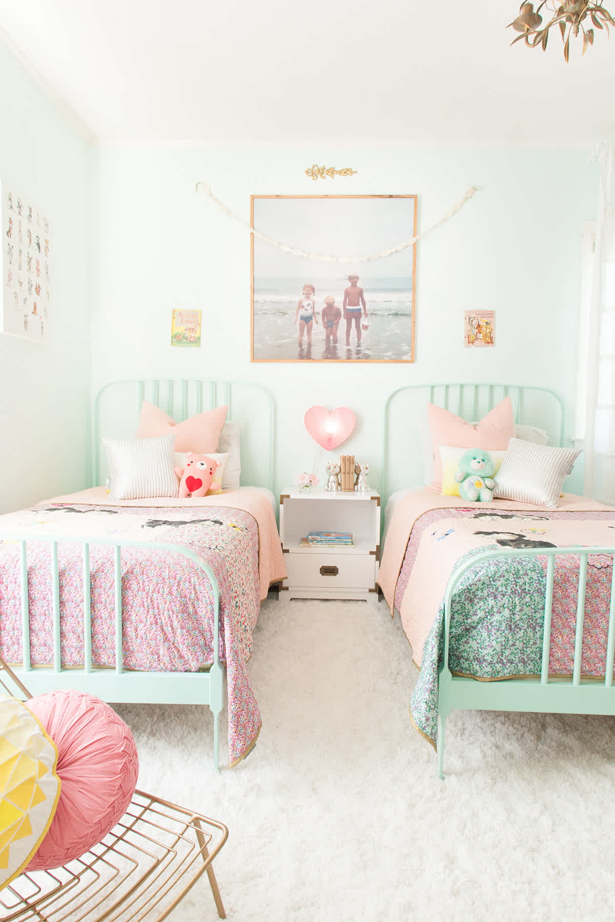
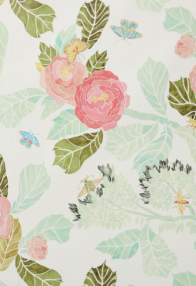
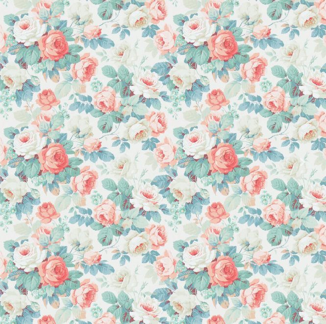
Mint & pink
Red and green are opposite (complementary) colors on the color wheel and if we decorated our homes in full saturated chroma red and green, we’d be celebrating Christmas all year round!
But if we change the value of those colors (the lightness or darkness) and changing the tint (adding white), tone (adding grey) or shade (adding black) to the colors, we get entirely new colors.
So mint and pink is in line with the red and green complementary line.

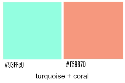
Turquoise and Coral
Turquoise and coral line up with the blue-green and red-orange colors on the color wheel. Such a beautiful color scheme!


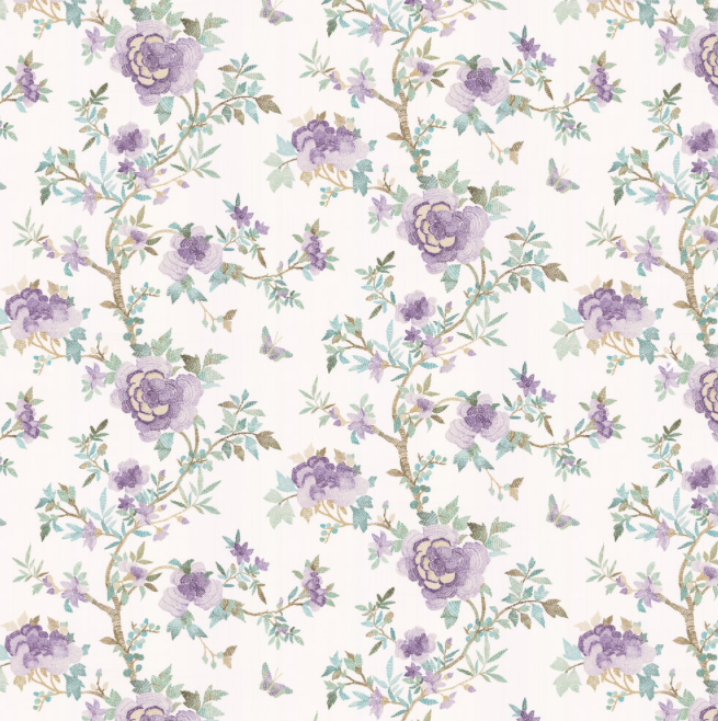
green and purple
Green and purple are in the yellow-green and red-violet complementary color line.


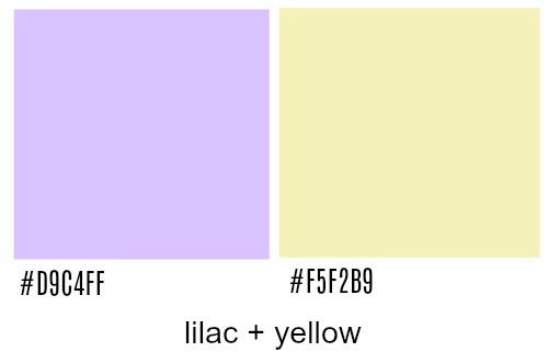
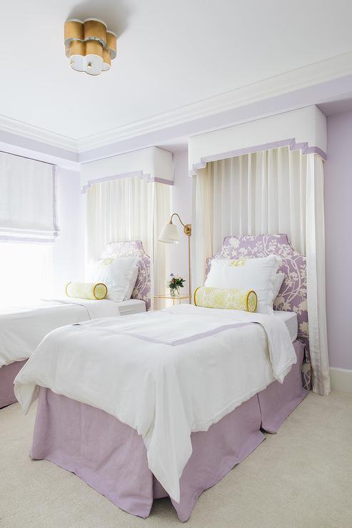
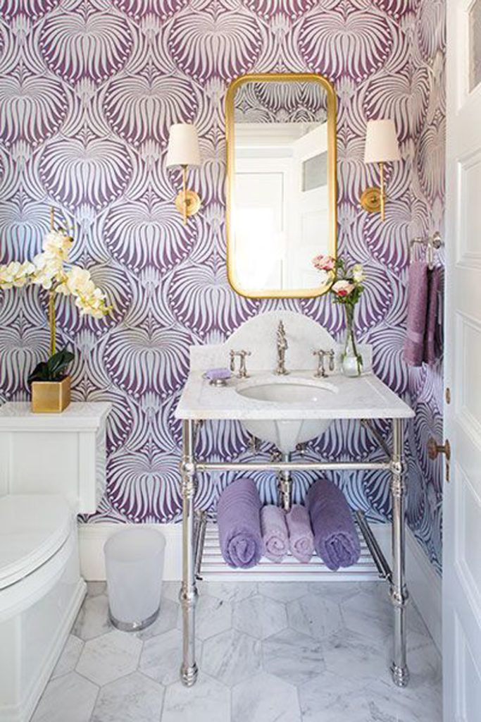
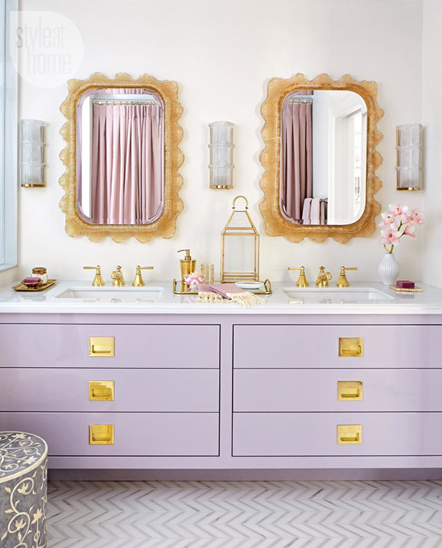
Lilac and yellow or Gold
This beautiful lilac and muted yellow are in the violet and yellow complementary color scheme.

It’s no wonder that all these colors look so good together!
I hope you had a fun time learning all about complementary colors in interior design.
Check the links below for more the color theory series.
Make sure to pin it for later!


click in case you missed:
How to Use a Color Theory for Decorating
Decorating with Achromatic, Analogous and Monochromatic Colors
Decorating with Split Complementary, Tetrad, Triadic and Clash Colors


Thank you Jamie, those beautiful pictures made me swoon! I will be thinking about these colour combinations for the next room overhaul.
Thanks Cheree. Definitely something to think about when decorating, right?
Hugs, Jamie
Such great information! Love this info on decorating! Thank you!
Thanks so much, Faye. I’m glad you found it helpful!
Hugs, Jamie
I love the variations of purple/lavender an green together as well as the pale pink an light mint green. Just lovely.
I love the variations of purple/lavender and green together. I also like the pale pink an mint green.. Just beautiful.