
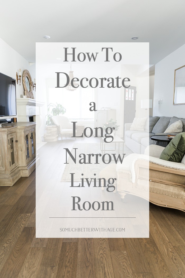
How to Decorate A Long, Narrow Living Room
Decorating a long narrow living room can be tough. Check out how I’ve decorated my living room space for the best layout ever!
The most challenging part of my home is that it is very long. It almost looks like a townhome because of its narrowness. I would love to have a different floor layout but with houses in our area being the highest in the country (my little home is worth nearly $2 mil!), I’m just grateful that I own a piece of property in Vancouver.
How can you decorate a challenging long living space? Let me show you how I’ve done it.
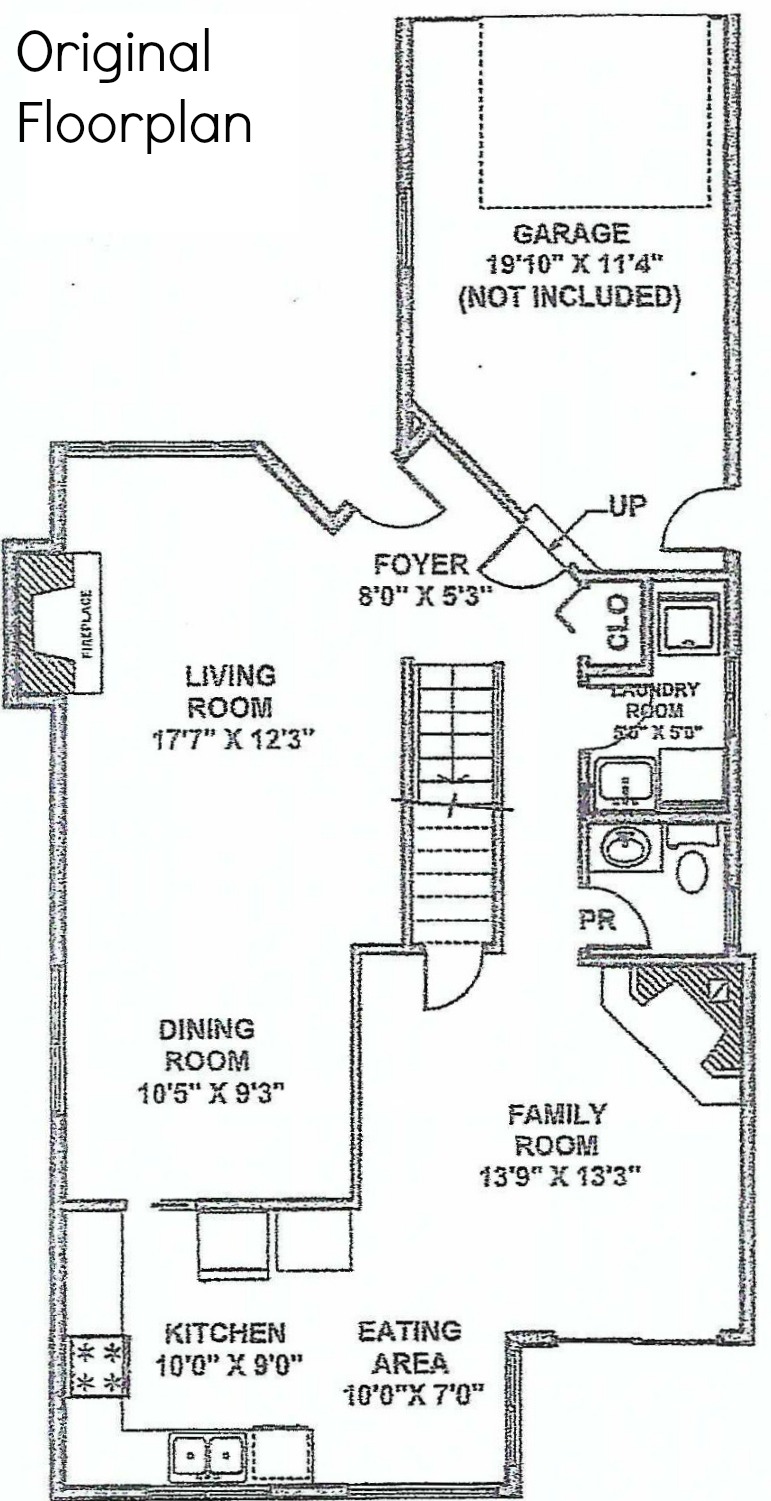
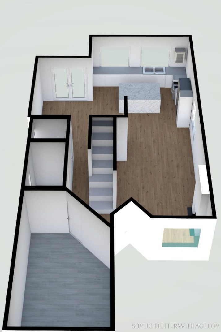
To begin with, let’s take a look at the original floorplan of my house.
As you can see below, the living room and dining room were one space before the renovation. We turned the family room into the new dining to make one larger living room.
The original floorplan before renovations
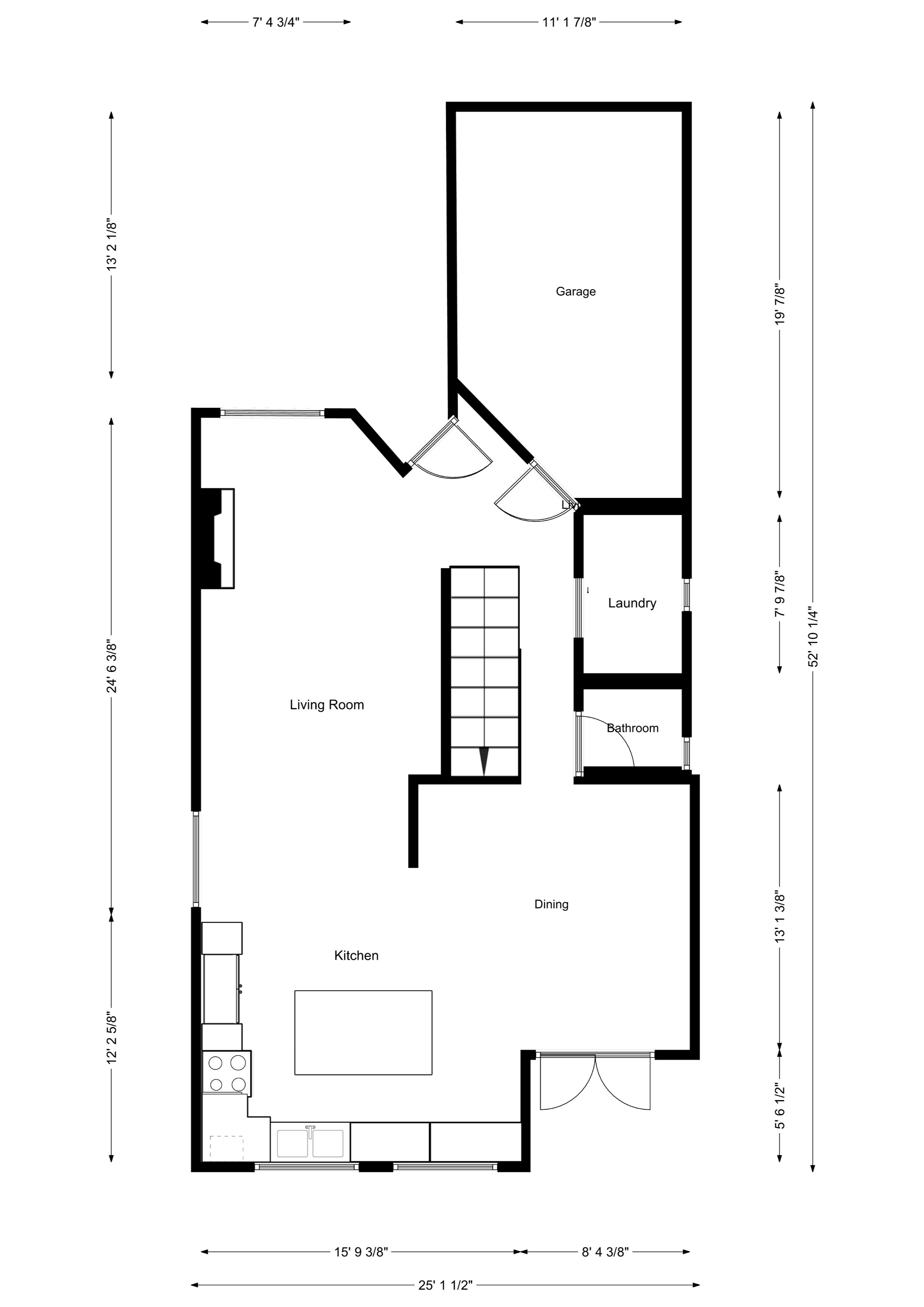
The kitchen became larger. The eating area and kitchen became one large kitchen with one large island. We added more cabinets (on the left) as well that extended out into the old dining room just up to the window.
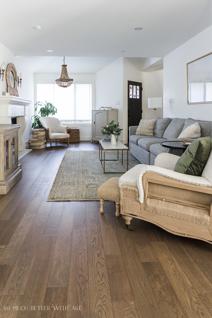
The living room now had more space but the challenge was now how to decorate it.
the challenging new floorplan
Here is the new floorplan of my main floor.
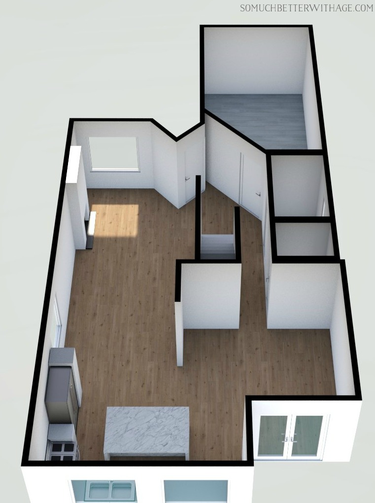
3D Renders
I also created some 3D renderings of my main floorplan for fun.
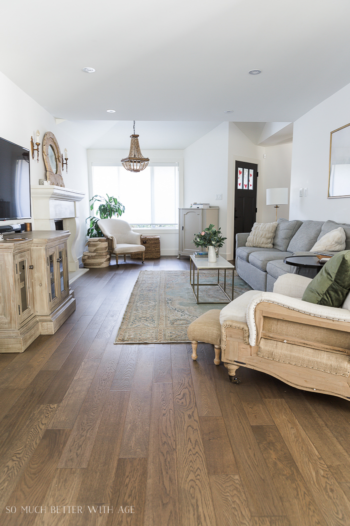
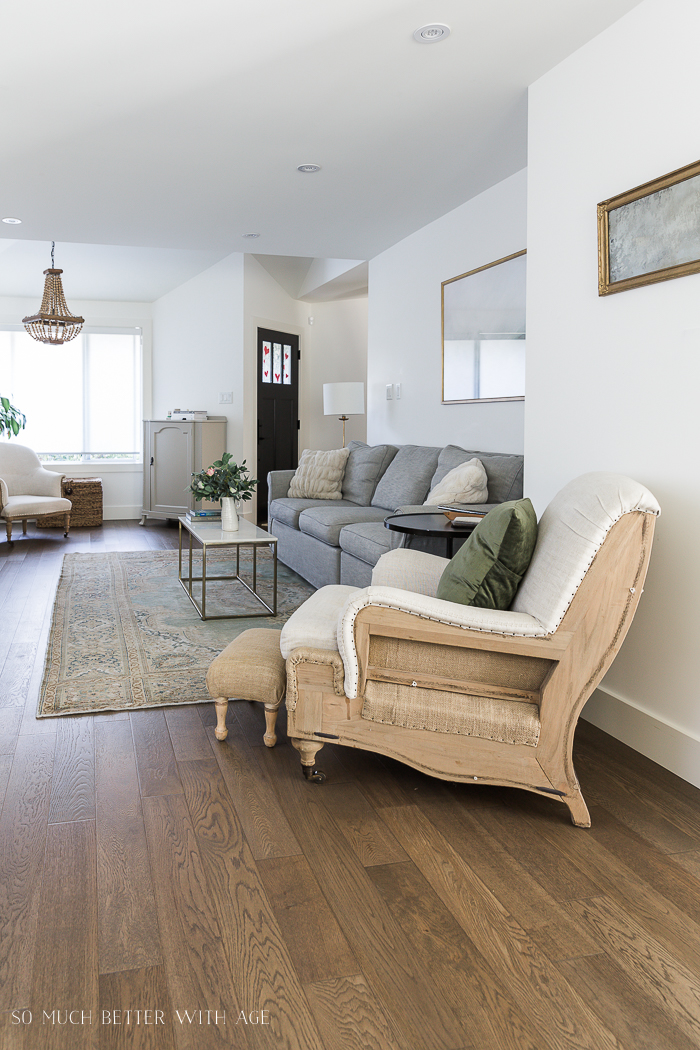
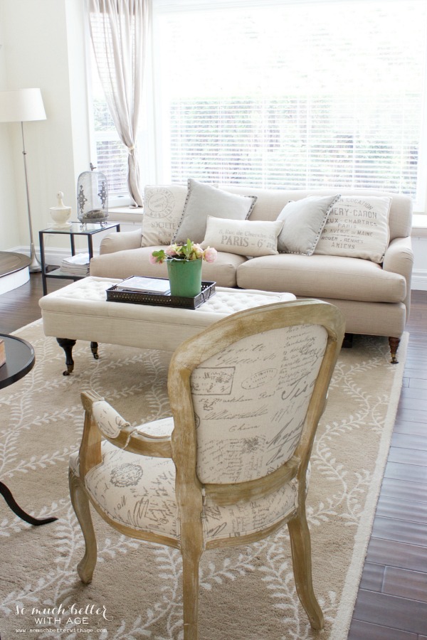
The couch is not directly in front of the fireplace as you can see in the floorplan so the TV and cabinet went to the left side of the fireplace. I liked that anyway as I don’t like TVs above fireplaces. We had a TV over one of our fireplaces in our old house and it’s too high for viewing, in my opinion.
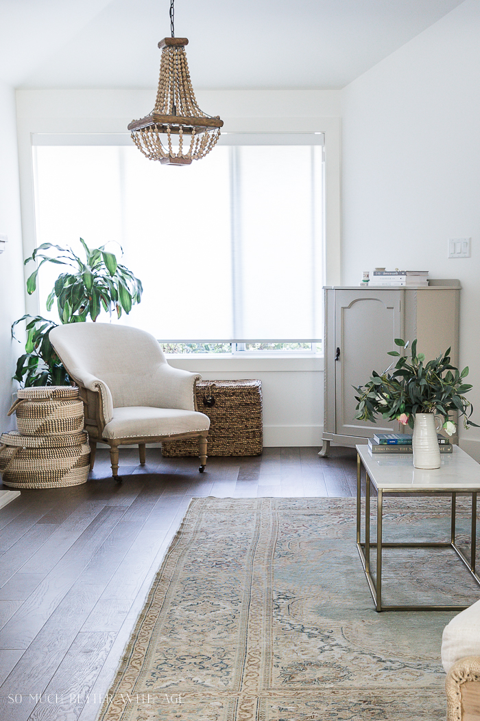
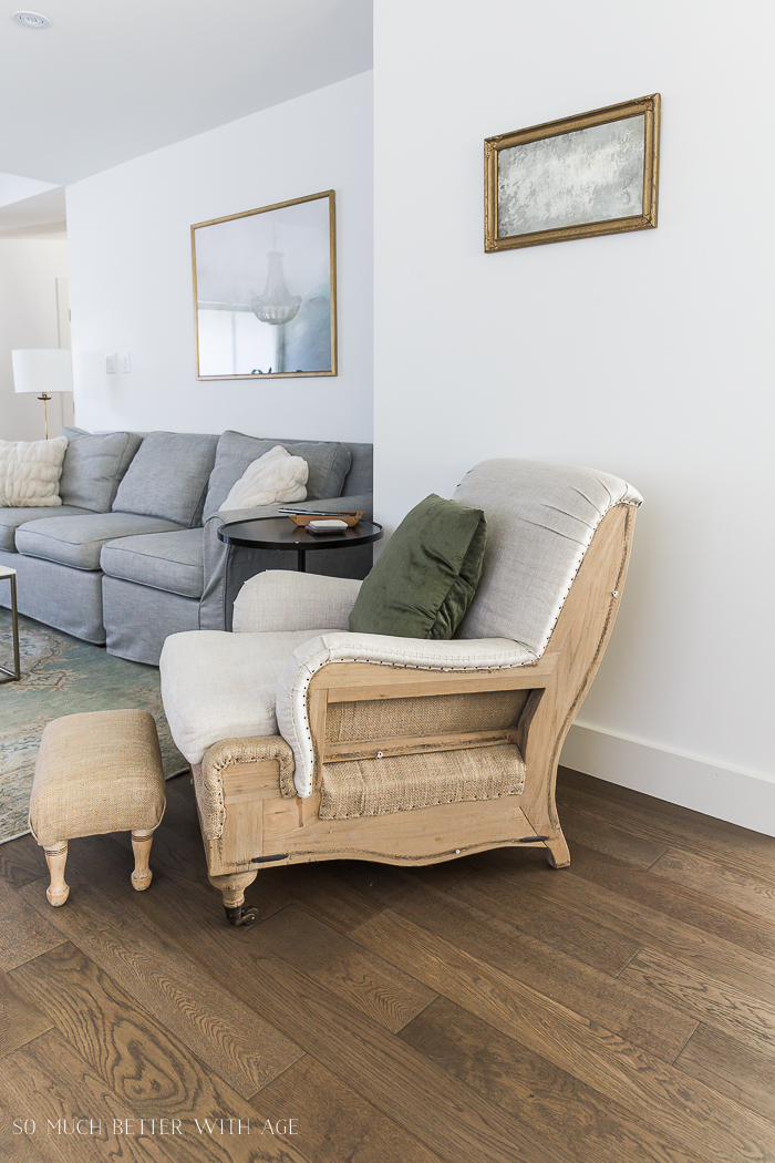
I wanted to create another seating area to break up the space and to also have another spot to relax away from the TV. I had a chandelier hung in front of the window area to differentiate that space.
how I decorated the living room previously
In the past, I’ve always had two arm chairs in this area.
Here is what this area looked like with the two chairs previously.
before

BEFORE
The sectional was in front of the TV and it tucked into that corner where the wall juts out so it has only one space to sit.
That wall houses a lot of essential wires and our sewer line to the ensuite bathroom so it could not be moved in the renovation (believe me, I tried to convince my contractor).
Here’s the floorplan again to show you how that short wall juts out.
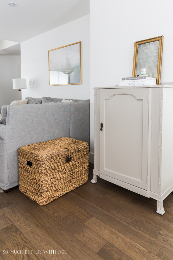
The cabinet that used to be on that short wall has now switched spots with an armchair.
BEFORE
opening up the space
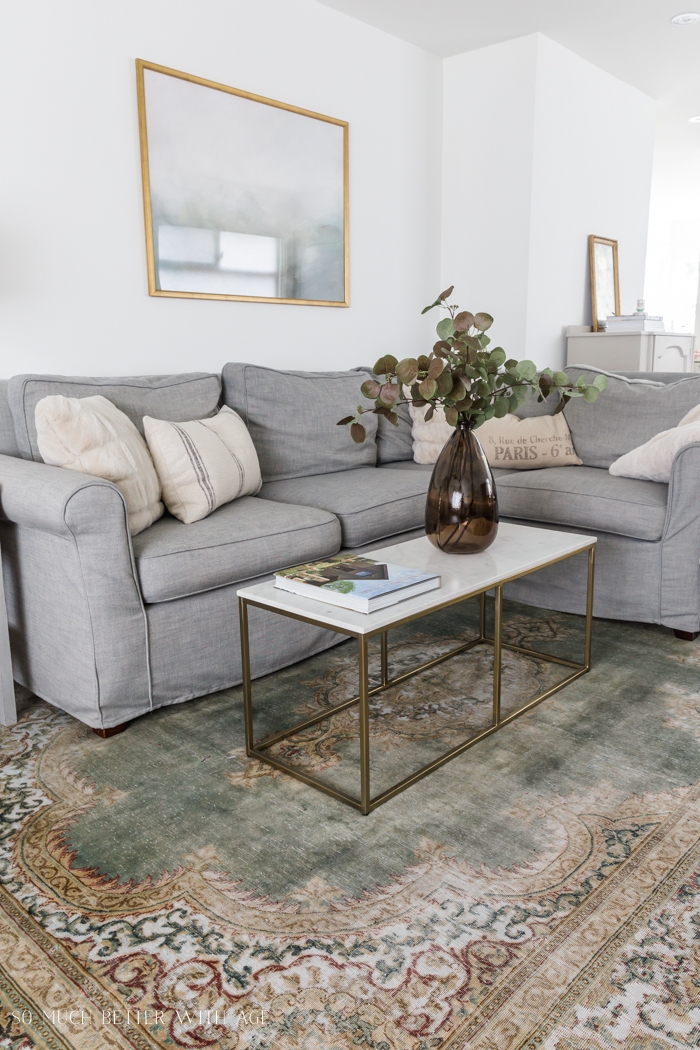
The chair now extends the living room area and there isn’t some awkward sectional part that lands in direct line with the TV (which made it awkward for anyone sitting on that end of the couch to watch TV).
This really opens up the whole space! The living room now looks larger instead of stopping half way in the middle of the room.
We removed that corner section of the sectional and moved the section on the right with the rest of the sofa so now it looks like a regular sofa/couch instead of a sectional.
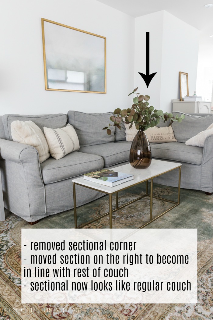
You can see that split/line between the two furniture pieces of the couch but for now it works for us before we invest in a new couch for the living room.
Disclosure: This post may contain affiliate links. Please read my disclosure policy.
And where is the corner section? Unfortunately, it’s in the newly renovated garage! We have to keep it so we can sell it all as one unit in the near future.
I think this layout is the best layout for this long, narrow living room space, don’t you think?
Sources:
- wall color – Simply White by Benjamin Moore
- Cameron Roll Armed couch with slipcovers in Premium Performance Basketweave
- gold and marble coffee table
- deconstructed armchair
- artwork – Morning Mist
- vintage rug – Pacific Rug Gallery
- throw pillows
- TV/entertainment cabinet – smaller version of this
Make sure to pin it for later!

click in case you missed:
Simply White by Benjamin Moore
How to Get European Decorating Style In Your Home

Ultimate Guide to Antiquing Mirrors

How to Use a Color Wheel for Decorating


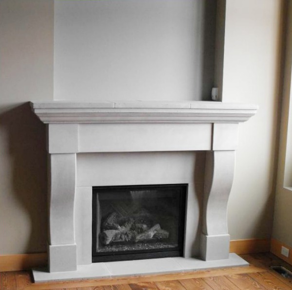
It’s much better balances with this arrangement. It’s curious why the fireplace was located where it is.
Balanced, not balances. Oops.
Thanks Martha. I know, so odd, right? I have no idea why they put the fireplace where they did. I think I finally found a layout that works!
Hugs, Jamie
…. I get it, about the fireplace. My rental has a fireplace totally in the wrong area. it makes me wonder why people don’t think about things like arrangements of furniture, when putting in a fireplace….. And often times it’s already there you can’t move it.. .
Yes this is the problem I’m having as well the fire place is in the wrong area and it makes no sense how to place my furniture
Wow! Your original floor plan is one of the most awkward and unusable floor plans I’ve ever seen. Good for you for making it workable – and inviting! I’m sure your family loves it.
Hi Marie,
I know, such a weird floorplan. And thank you! It’s a more usable space for sure.
Hugs, Jamie
Who is Marie?
You might have accidentally clicked the box that said ‘notify me when new comments are added’. I responded to another reader named Marie and it might have come to your inbox.
It looks like you maximized the usage in the space. I also had to deal with a very narrow house when we lived in Pittsburgh. It was a challenge, but I think that’s when we’re most creative. You have a beautiful home!
I totally agree, Jennifer! I’ve had to think of different ways to decorate than I would have in a ‘regular’ space.
Hugs, Jamie
What a lovely, light , inviting room. I understand the frustrations and struggles with a narrow room as mine is quite similar though narrower at 10 ft 9ins and shorter with dining area. Where your short wall is are my stairs! I could scream sometimes trying to find suitable furniture arrangements. I shall be revisiting your room for ideas. So thank you and well done
Oh I feel your frustration, Margaret! So basically my original floor plan with the dining room is what your space is like. It’s definitely a challenging space to decorate, it’s making me become a minimalist!
Hugs, Jamie
It looks great! I also love your carpet – can you share where it’s from? Or is it on your blog somewhere?
Also, I’m wondering if you will be offering e-design. We moved not too long ago into a 100 year old home. I need help! Thanks!
Hi Faye,
Thank you! The rug is from a local rug shop here in North Vancouver called Pacific Rug Gallery. And yes, I’ll be doing e-design! I should be ready to start mid June.
Hugs, Jamie
Really dislike. Looks more like a walk through instead of being in the space. Too many chakas— takes away from the space it can become.
Oh interesting. I’d love to hear how you’d decorate this long space differently. And what are chakas?
Probably means tchotchkes, decorative doodads.
Right. I just have 5 book, one floral display and two mini vases on the mantel. I thought it was pretty minimal for decor.
Yes, I agree, and find your space very restrained, with very few tchotchkes, if that’s what Md Cifelli meant by chakas. Unfortunately, I am of the “more is more” persuasion, not a minimalist at all. Wish I were happy that way, there would be so many fewer things to dust!
I noticed that when you changed your floor plan that the closet by the garage door was eliminated. Is it now in the laundry room?
Hi Vicky,
Yes we moved the walls that made up that small closet and made it into one bigger laundry room.
You can see more of it here: https://somuchbetterwithage.com/12-essentials-when-renovating-a-tiny-mudroom-while-keeping-it-pretty/
Hugs, Jamie
I love it! I have the worst lounge ever….. Long with a protruding fireplace and a door either side of it! I’m finding it impossible to decorate
That sounds so difficult!! Hopefully you found a way to get creative. Sorry I had missed your comment before.
Hugs, Jamie
I have a very long narrow living room that is so hard to place furniture because I have too many door openings.
One from the foyer, one from the kitchen, large one from the dining area on the right side of room.
One large opening from the family room on left and one door opening from master bedroom on left coming from foyer.
Yours is beautiful!
Hi Kay,
Oh wow, that does sound challenging. It sounds like you really have to get creative as you have main traffic flows coming from every angle. Thank you for taking the time to comment.
Hugs, Jamie
Really like your arrangement of a long living room. I have the similar issues. I am particularly attracted to the flooring you have chosen and wondered if you would be prepared to share the colour/shade and type of flooring.
Hi Sharman,
The flooring in our house is in this post here at the very top: https://somuchbetterwithage.com/house-source-list/
We had it installed when we moved in about 5 years ago.
Jamie
My mother would like to have her living room remodeled, and that is why she’s currently looking for some wall mirrors too. Thank you for sharing here as wll the importance of having a proper layout. It’s also a good thing that you suggested here that it would be a great idea to install a new fireplace in it.
Hi Rachel,
Sorry for the delay! Thank you for your comment. It’s such a challenge decorating narrow spaces!
Hugs, Jamie
Your changes look wonderful! Anyone that can afford any kind of home in Vancouver are fortunate. Beautiful home.
Hi Debbie,
Oh I know, it’s so expensive. Luckily I bought a place 20 years ago, that was the only way I’ve been able to live her still.
Hugs, Jamie
Hi, beautiful. We’ve just moved into a Edwardian (we’re in England) terrace house with a narrow’ish living room with a bay window. And love the way you’ve laid out yours. Love the armchairs. Where did you get the one under the window. Obviously I’m guessing I won’t be able to get the same one here. But need an idea of what to Google 😆
Thanks,
Emily x
Sorry, I meant .Beautiful! As in the room is beautiful, although I’m sure you are too. Haha
I love how you have arranged your furniture to best accommodate the wall that juts out. Just curious if you ever thought about switching your living room to the dining room space and putting the dining room space where the living room space is? The way your front door is situated, visitors could just come right down the hallway into the living room or wall through the dining room to the kitchen. Just a thought!
Sheri
Hi Sheri,
It’s probably hard to tell but the front door kinda opens into the living room. It’s just so awkward because of the length but I think I’ve made it work! Thanks for commenting!
Hugs, Jamie