
Complementary Colors
Do you want a foolproof way to decorate with color? Follow this color theory series to learn more. Today it’s all about complementary color scheme!
Originally published in 2020 but updated in 2026.
Disclosure: This post may contain affiliate links. Please read my disclosure policy.
If you are coming from Lesson 1: Color Theory for Decorating, here is Lesson 2, all about complementary colors!
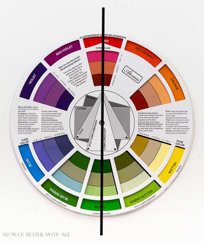
What is a complementary color?
Complementary colors are the complete opposite colors on the color wheel so it’s no wonder that red and green look so good together (hello Christmas). Same as a navy painted wall with a brown-y/orange leather sofa. Below are some complementary color scheme examples.
3 Complementary Color pairing examples
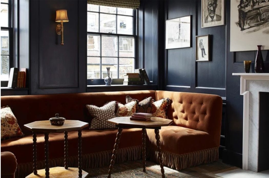
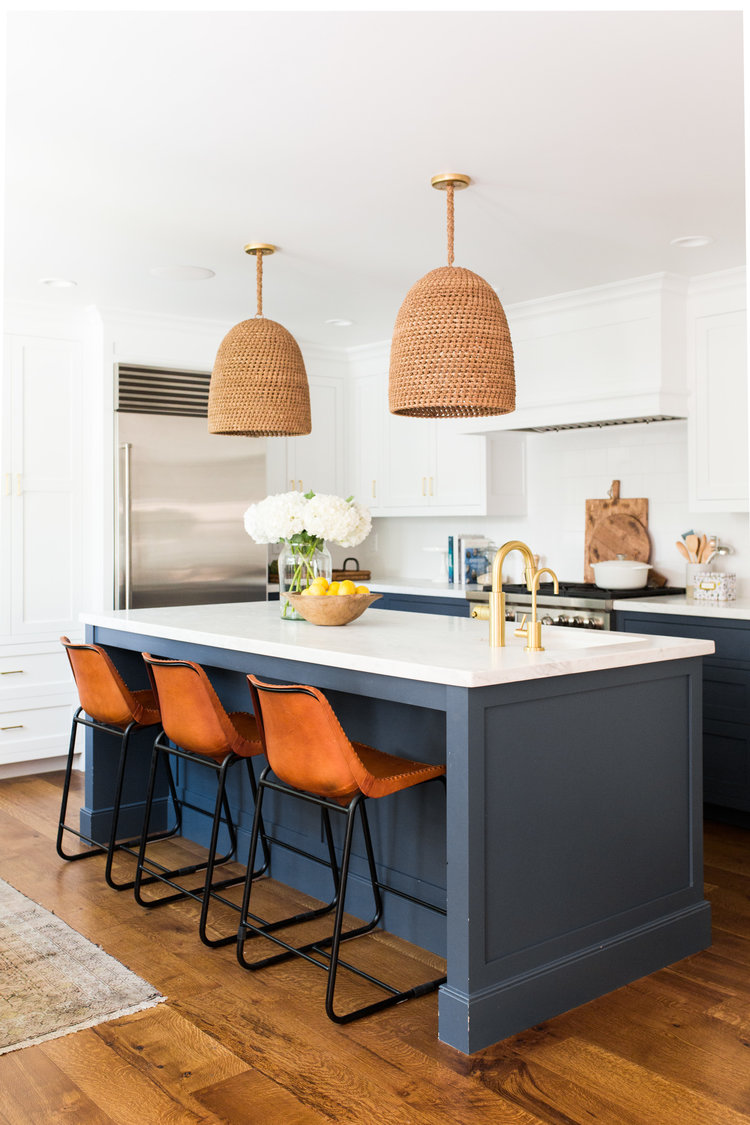
Blue and Orange
When you look at blue on the color wheel, you’ll see the complementary color is orange. Full chroma blue and orange colors do look good together but it may not be what you want to decorate with. Using lighter tints, tones and shades will give you a lot color options to decorate with. Just look at the beautiful blue and orange complementary color schemes below.

Green and Red
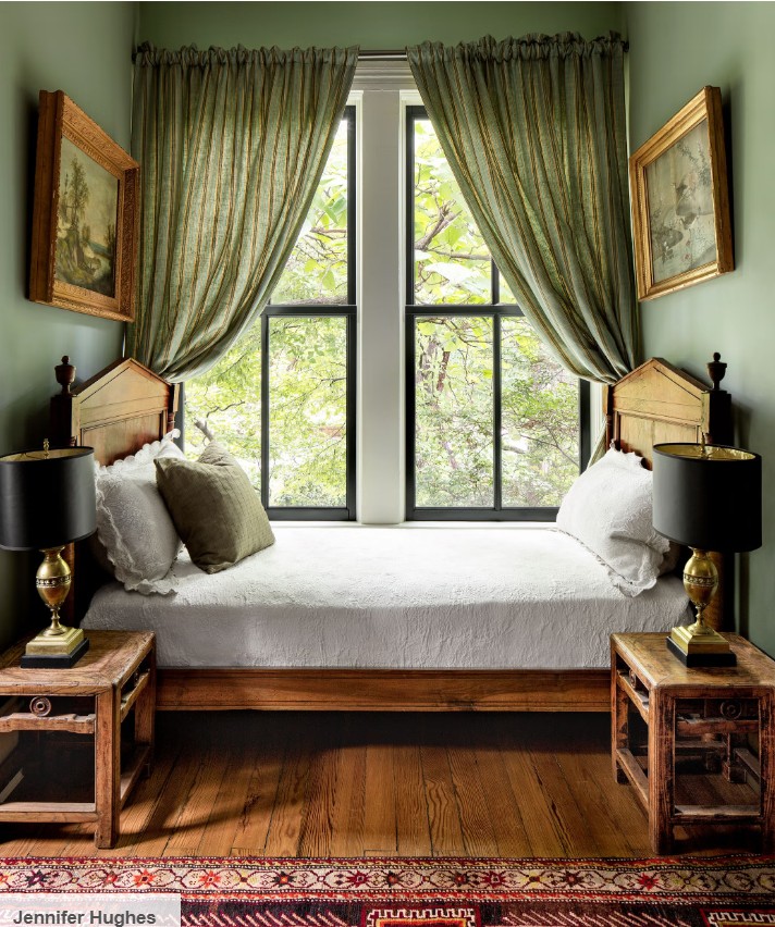
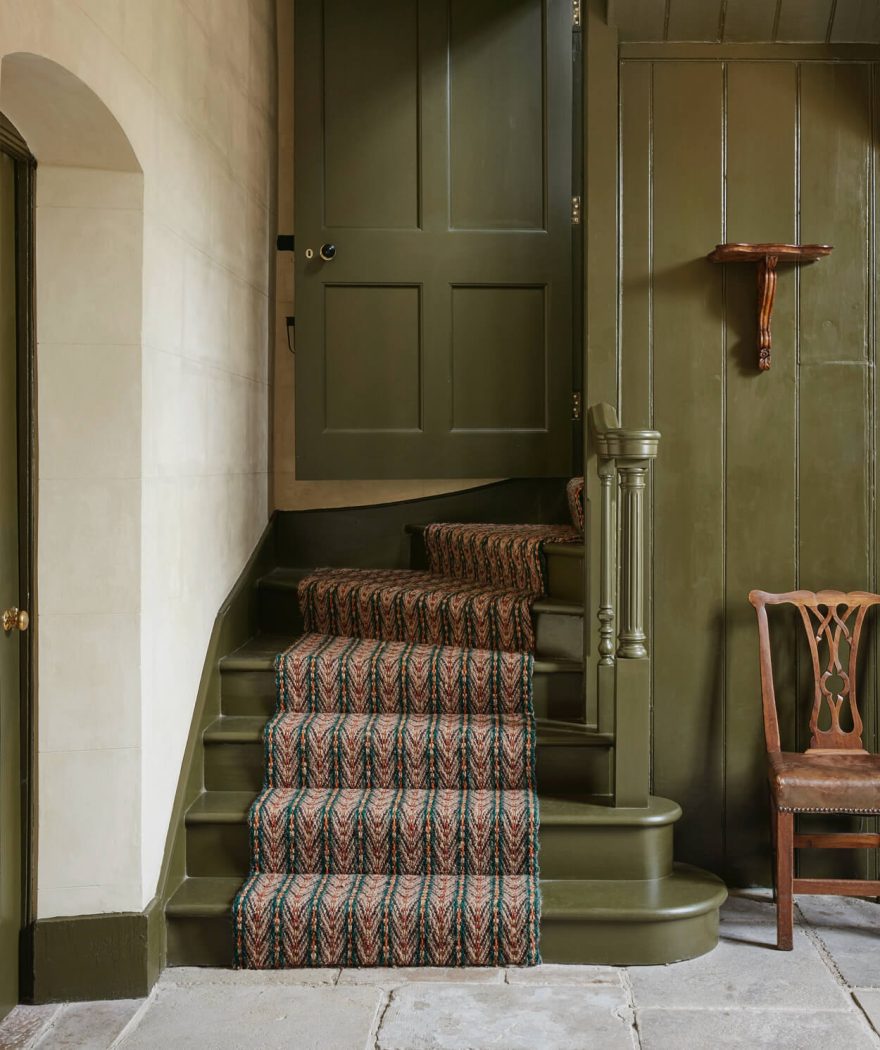
if we decorated our homes in full saturated chroma red and green, we’d be celebrating Christmas all year round! But there’s a reason these colors look so good together. Green walls and a red vintage rug? Perfection!
Violet and Yellow
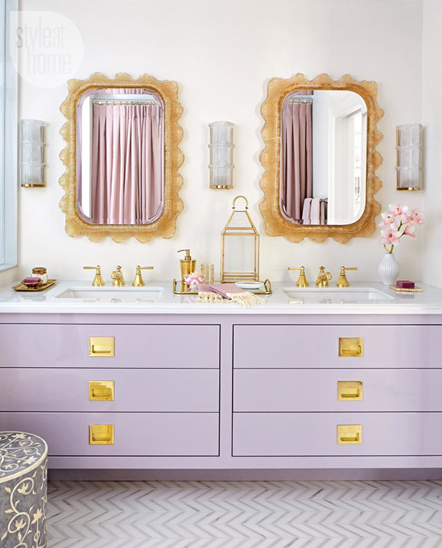
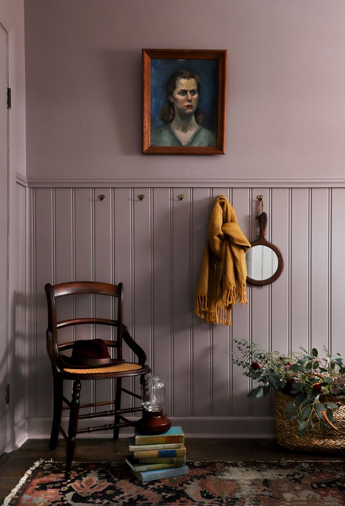
Violet/purple tones are so rich and deep which yellow reads so cheery! Gold can most definitely be the yellow color in this complementary combination.
I hope you learned all about complementary colors in interior design. Be sure to continue series with Lesson 3: Decorating with Achromatic, Analogous and Monochromatic Colors.
Get your own artist’s color wheel here.
Make sure to pin it for later!


click in case you missed:
Lesson 1: How to Use a Color Theory for Decorating
Lesson 3: Decorating with Achromatic, Analogous and Monochromatic Colors
Lesson 4: Decorating with Split Complementary, Tetrad, Triadic and Clash Colors

Thank you Jamie, those beautiful pictures made me swoon! I will be thinking about these colour combinations for the next room overhaul.
Thanks Cheree. Definitely something to think about when decorating, right?
Hugs, Jamie
Such great information! Love this info on decorating! Thank you!
Thanks so much, Faye. I’m glad you found it helpful!
Hugs, Jamie
I love the variations of purple/lavender an green together as well as the pale pink an light mint green. Just lovely.
I love the variations of purple/lavender and green together. I also like the pale pink an mint green.. Just beautiful.