How to Pick A Home Color Palette
This lesson will simplify colors for your home and the best way to pick out your home color palette.
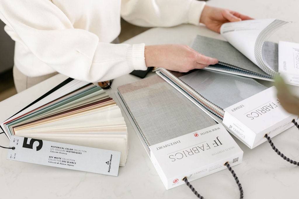
Picking a color palette for your home can be one of the most overwhelming decisions you may have to make when it comes to home decorating.
With so much inspiration and color choices to be had, we can all reach decision fatigue easily! I get it, I’ve always been pretty solid in what I love design-wise, but even I have veered off path because I thought something was better or cooler or I-don’t-know-what! Having a plan of your color palette helps tremendously! Once you know what colors you want in your home, everything from wall color, fabric choices, decor choices, furniture, falls into place!
Color Theory Design Series
This is a design series so be sure to check out these lessons if you haven’t already:
- Color Theory for Decorating
- Decorating with Complementary Colors
- Decorating with Achromatic, Analogous and Monochromatic Colors
- Decorating with Split Complementary, Tetrad, Triadic and Clash Colors
Home Color Palette
The biggest challenge when creating a home color palette is that every room in the house relates to each other, a thread of continuity throughout the home. There’s nothing wrong with painting rooms in different colors but if they are jarring to walk into and don’t relate to the other rooms in the house, your home will not feel consistent and will feel off.
By creating a home color palette before any renovations or decorating begin, you cut out the impromptu decisions and keep on a consistent path to decorate the home of your dreams.
60 / 30 / 10 Rule
Don’t worry, we’re not going to get into math (only a little bit using a pie shape). The numbers 60/30/10 show how much of a percentage we need for each color that we pick for our home color palette. Ideally, three colors are best when choosing a home color palette (no surprise there since interior design loves things in odd numbers).
Three colors are perfect for a home color palette. The dominant color would take up 60% of the space, the secondary color 30%, and an accent color 10%.
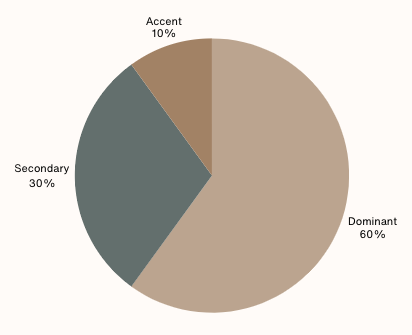
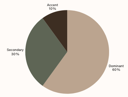
If you prefer to use four colors, 60% would still remain dominant, 20% dominant and two accent colors at 10% each.
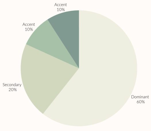
This isn’t exact, of course – you don’t need to have a room have exactly 20% of a secondary color but this gives you an excellent guideline for a foolproof color format for your home.
Where to use each color
For the dominant color, use the color on walls, in wallpaper or cabinetry color.
For secondary color, use it on furniture, millwork, curtains, rugs, bedding.
For accent color, use the color(s) on pillows, throws, home decor items.
Home Color Palette Ideas
Here are four colors that look beautiful together. There’s a variation of different shades and tones with the colors to get a good mix.
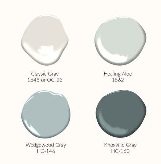
Now you can mix them up using our 60/30/10 rule or in this case, 60/20/10/10 rule.
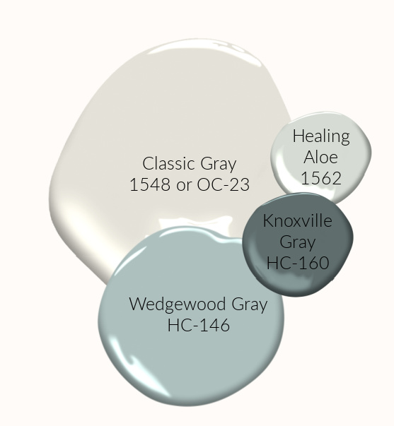
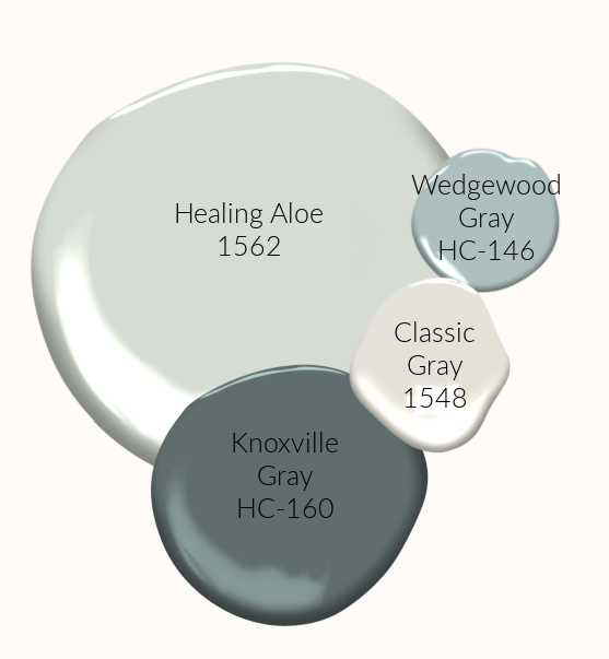
You can see how the choices are endless when you pick colors you love using the color theory lessons you learned about.
I hope this has helped you to create your own home color palette.